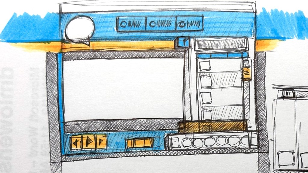
PBS KIDS Go 2.0
SKETCHES | WEB

- TOOLS / SOFTWARE:
- -------------------------
- Rendr Sketchbook
- Palomino Blackwing 602 Pencil
- Mechanical Pencil
- Staedtler Pigment Liner Pens
“Big paper, big ideas was the slogan,” Chris Bishop would tell me. I love that; grab a stack of paper more prominent than what you used to work with and go for it.
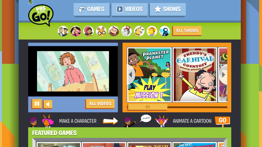
The PBS KIDS GO! had a 12-day timeline, something unheard of at PBS KIDS. However, I had previously worked in places with unrealistic timelines, so I rolled up my sleeves and leaned in. These designs focus on the explosion of our target audience getting their parent’s first-generation iPhones which did not support the Adobe Flash player. It was an exciting challenge to take an immersive interactive world and flatten it into a set of curated feature graphic grids.

Final Product
Pens, pencils, coffee and more. Now lets see how we made these sketches into the PBS KIDS GO home page.

